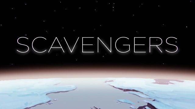
It's always nice to get the chance to do something a bit different so in a refreshing departure from our usual day to day work we were thrilled to be invited by Autodesk to put together the visuals for their 'Motion Graphics and More' landing page - http://motiongraphics.autodesk.com/
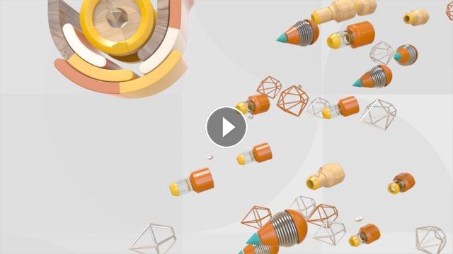
The brief was simply to create some interesting animated visuals for the site. Rather than a 'background video' we proposed the idea of using the scroll bar as a play button so that as a user scrolls down the page the background animates accordingly. The fun aesthetic was intended to both create a look not typically/traditionally associated with Maya and to keep file sizes friendly.
In the end, the overall process wasn't that dissimilar to creating a linear video but the project did throw up some interesting challenges around matching up the distance the 3d Maya camera travels with the scroll bar and easing in and out of each 'scene' as a user hits the different section of the website. Of course, our trusted friend MASH featured heavily in this - https://vimeo.com/album/4046248.
Working closely with the guys at http://torpedogroup.com who implemented the site we got to a very happy place. This is a 'making of' covering some of our input.
Check out this 'Quick Tut' too - https://vimeo.com/185462190 We'll try and add to this!
Client - Autodesk
Direction/Design - Mainframe
Implementation - Torpedo
- Category
- Motion Graphics - Making Of
- Tags
- maya, motion graphics, parallax, website, mainframe, mainframenorth, autodesk


